10 Essential Principles of Responsive Web Design for Today’s Juggling Act
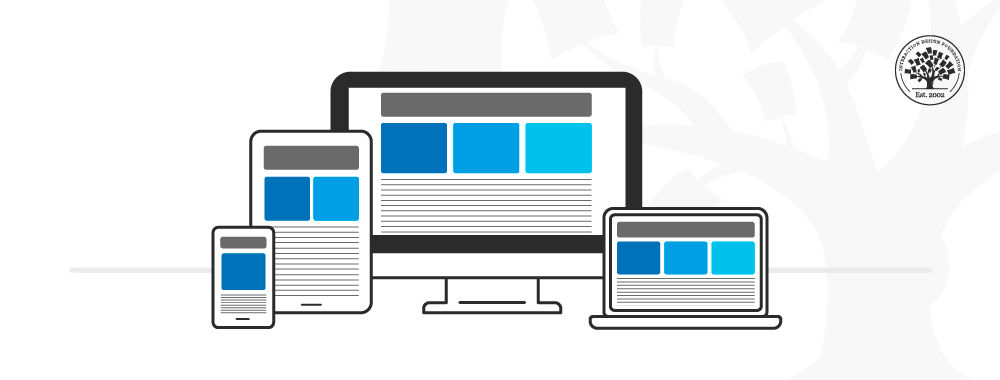
Responsive web design has become a crucial aspect of website development as users access the internet through a myriad of devices. Incorporating 10 essential principles ensures that your website remains functional and visually appealing, regardless of the screen size. These principles include:
- Flexible Grids
- Fluid Images
- Media Queries
- Mobile-First Approach
- Viewport Meta Tag
- Responsive Typography
- Touchscreen Readiness
- Performance Optimization
- Testing and Compatibility
- Accessible Design
Implementing these responsive design principles allows for a seamless user experience that caters to the modern audience's needs. By focusing on a mobile-first approach, designers can ensure that their sites not only look good on mobile devices but also function efficiently. Emphasizing fast loading times and accessibility through various screen sizes is essential in today’s juggling act between potentially conflicting web standards and user expectations.
How to Balance User Experience and Functionality in Responsive Design
Balancing User Experience and Functionality in responsive design is crucial to ensure that users have a seamless interaction with your website across various devices. To achieve this balance, it's important to implement a mobile-first approach, where you design for smaller screens before scaling up to larger devices. This encourages simplicity and clarity, ensuring that essential features are easily accessible. Furthermore, consider employing techniques such as fluid grids and flexible images, which allow your layout to adapt smoothly to different screen sizes without sacrificing usability.
Another key factor in this balance is to prioritize content hierarchy and visual elements effectively. Use clear navigation menus and call-to-action buttons that guide users through your site. Additionally, leveraging whitespace can enhance readability and focus, making the content more engaging. Regularly conduct usability testing to gather feedback and monitor user behavior across different devices, which will help you refine your design and better align functionality with user expectations. In doing so, you will create a responsive design that not only meets the functional needs of users but also provides an enjoyable experience.
Are You Juggling Too Many Devices? Tips for Streamlined Responsive Web Design
In today's fast-paced digital landscape, many users find themselves juggling too many devices to access the web. From smartphones to tablets and laptops, the variety of formats can quickly become overwhelming. This inconsistency not only affects user experience but can diminish the effectiveness of your website. To combat this issue, adopting a streamlined responsive web design strategy is essential. This means creating a unified user interface that adapts seamlessly across different devices, ensuring consistency in look and functionality.
To help you achieve a more streamlined responsive web design, consider the following tips:
- Prioritize content: Ensure your most important information is accessible and prominent on all devices.
- Use flexible grids and layouts: This allows your design elements to resize fluidly, enhancing usability.
- Test on multiple devices: Regularly check your website's performance across various platforms to identify any shortcomings.