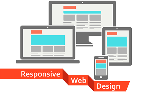
Understanding the Principles of Responsive Web Design: A Comprehensive Guide
Responsive web design is an approach that allows websites to adapt seamlessly to various screen sizes and devices, ensuring a consistent user experience. By utilizing a combination of flexible grids, layouts, and images, alongside CSS media queries, web designers can create interfaces that look and function effectively across smartphones, tablets, and desktops. This principle not only enhances usability but also has significant implications for SEO. Search engines prioritize mobile-friendly sites, making responsive design a critical element of modern web development.
One of the core principles of responsive web design is fluid grids, which shift elements proportionally rather than in fixed pixel dimensions. This allows your website layout to adjust based on the user's screen size. Additionally, media queries enable developers to apply styles based on specific conditions like device width, height, orientation, and resolution. Implementing these features helps maintain readability and navigability, ultimately reducing bounce rates and boosting SEO performance. By following these fundamental principles, you can create a more adaptable and user-friendly website.
The Impact of Screen Sizes on User Experience: Navigating the Responsive Web Design Paradox
The rapid proliferation of mobile devices has made responsive web design more critical than ever. With users accessing websites from a wide range of screen sizes, from smartphones to large monitors, the need for a seamless experience across all devices has become paramount. Responsive design allows developers to create a single website that adapts fluidly to any screen size, ensuring that content is always accessible. However, this immense flexibility can also introduce challenges, as designers must prioritize what content appears on various devices and how it is displayed. Without careful consideration, users may encounter a frustrating experience that detracts from their interaction with the site.
Furthermore, the impact of screen sizes on user experience cannot be overstated. Research shows that larger screens often lead to improved engagement, as users can view more information without excessive scrolling or zooming. Conversely, smaller screens may compel designers to condense features and content, which might hinder user interaction. To navigate this responsive web design paradox, developers should adopt a mobile-first approach, designing for the smallest screens first and progressively enhancing the experience for larger devices. This strategy ensures that essential functionality is retained, creating a more intuitive and satisfying user experience across all platforms.
How to Achieve Fluid Layouts: Tips and Tricks for Effective Responsive Design
Achieving fluid layouts is essential for effective responsive design, as it allows your website to adapt seamlessly to different screen sizes and devices. To start, consider using relative units like percentages or viewport widths instead of fixed units such as pixels. This approach helps maintain the proportions of elements on the page regardless of the display size. Additionally, implementing a CSS framework like Bootstrap or Foundation can speed up the process and provide built-in grid systems that promote fluidity. Here are some tips to keep in mind:
- Utilize media queries to adjust layout properties at various breakpoints.
- Optimize images and graphics to ensure they scale appropriately across devices.
- Test your design on multiple devices to identify any potential issues.
Another key aspect of fluid layouts involves the use of flexbox or grid systems in CSS. These tools offer flexible alignment and spacing options, which make it easier to create visually appealing and organized layouts. A fluid layout not only improves user experience but also enhances SEO rankings, as search engines favor mobile-friendly designs. Remember to prioritize content over aesthetics—ensure that text is readable and that navigation is intuitive. To summarize, implementing a fluid layout is a strategic move for both user engagement and search engine optimization:
“Design is not just what it looks like and feels like. Design is how it works.”
